Redesigning marketplace Auto.pt
From audit to action: transforming UX chaos into clarity
Led the strategic redesign of auto.pt, a major vehicle marketplace in Portugal, focusing on simplifying navigation, improving search and browse experiences, and aligning the platform with modern usability standards. The overhaul delivered measurable improvements in engagement, search success, and lead generation, while reducing friction for buyers and sellers alike.
Context
Company: Pixelplan
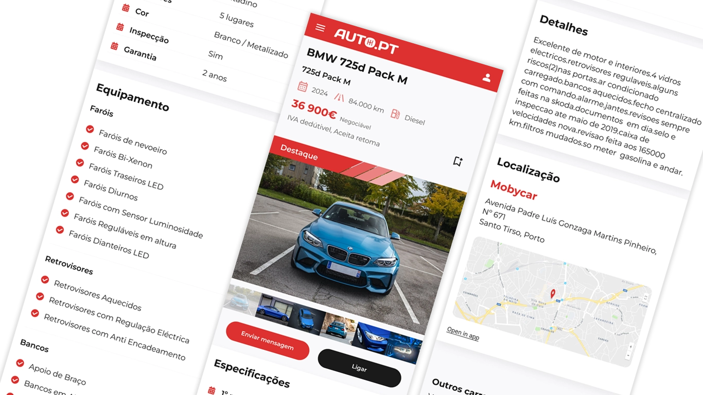
Product: auto.pt – a leading online marketplace for new and used vehicles in Portugal.
Industry: Automotive digital commerce
Scope: UX strategy, information architecture, interaction design, responsive redesign
Audience: Buyers (individuals & businesses), Sellers (dealerships & private sellers)
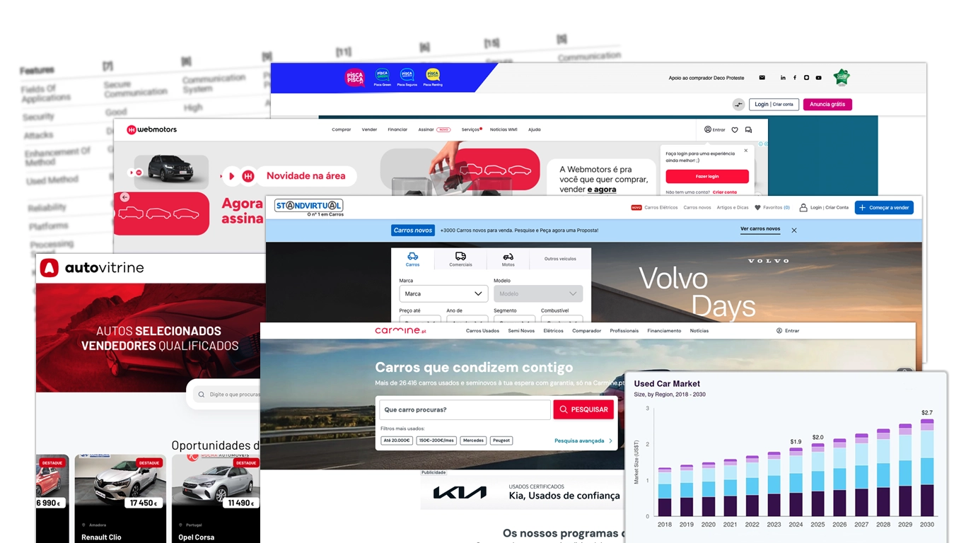
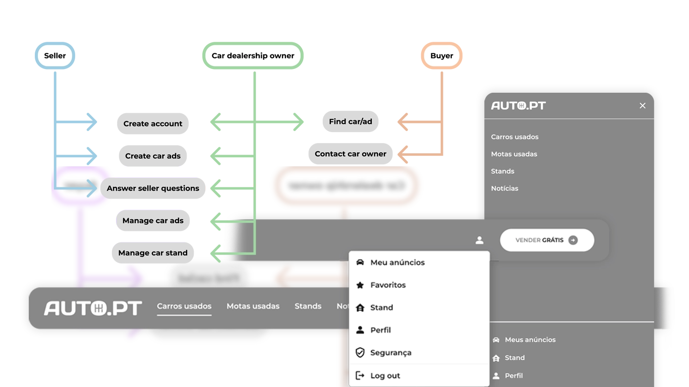
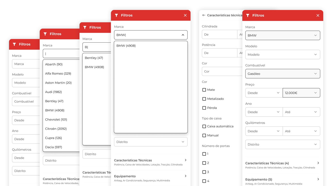
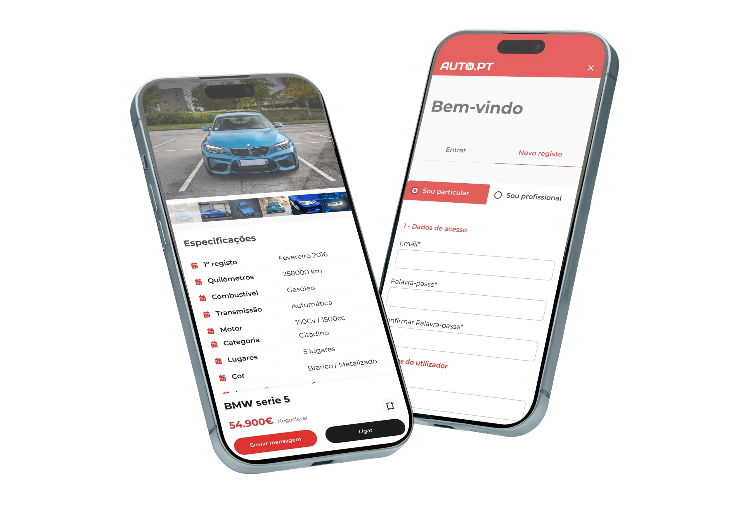
Auto.pt connects buyers and sellers of vehicles. The existing platform had usability and conversion challenges due to complex browsing paths, unclear information hierarchy, and mobile friction in discovery and search.
The Problem
Although auto.pt was a central destination for vehicle shoppers in Portugal, it struggled with:
• Navigation complexity: Multiple entry points, unclear hierarchy, and inconsistent menus.
• Search friction: Users had difficulty from the outset. Filtering, sorting, and comparing vehicles was cumbersome.
• Poor mobile experience: Key buying journeys were harder to complete on phones and tablets.
• Unclear conversion flows: Calls‑to‑action (contact seller, request financing) were buried or inconsistently presented.
These issues created friction in discovery and conversion, reducing engagement and lead generation.
My Role
Led the redesign strategy for auto.pt, partnering with product stakeholders, analytics, engineering, and QA. Focus areas:
• UX strategy and research
• Information architecture
• Interaction design
• Responsive redesign
• Prototyping and validation
Process & Key Contributions
Discovery & Diagnosis
Rationale: Before redesigning, understand what was working, and what wasn’t, across devices.
Action:
• Heuristic audit (navigation, search, lead actions)
• Analytics review (drop‑offs, bounce rates, search abandonment)
• Competitive scan (other auto marketplaces)
Outcome:
Identified key friction points: mobile drop‑off after search, low filter usage, unclear CTAs on vehicle detail pages, and high bounce on category pages.
Information Architecture and Navigation Strategy
Rationale: Users struggled to orient themselves due to unfocused navigation and weak hierarchy.
Action:
• Restructured navigation around primary user goals
• Introduced clearer category pathways and contextual filters
• Designed persistent search and filter panels
Outcome: Reduced cognitive load and improved discoverability, especially for first‑time visitors.
Search & Filtering Redesign
Rationale: Vehicle searches are core to the experience; if this fails, users leave.
Action:
• Revamped search UI with smart defaults
• Introduced sticky filtering with clear labels
• Allowed multi‑criteria comparisons and saved filters
Outcome: Higher engagement in search sessions and a better path to conversion.
Mobile‑First Interaction Design
Rationale: Most traffic was mobile, yet key paths were painful on phones.
Action:
• Mobile‑optimized browse and search
• Sticky CTAs for contacting sellers or requesting info
• Simplified CTA progression to reduce taps
Outcome: Smoother discovery and stronger conversion signals on mobile.
Vehicle Detail and Conversion Flow Design
Rationale: Vehicle pages are conversion anchors; they must guide decisions efficiently.
Action:
• Redesigned layout with prioritized info hierarchy
• Added clear CTAs (Contact, Call, Save, Finance)
• Included trust signals (reviews, dealer badges) and price clarity
Outcome: Higher lead submission rates, clearer decision points for users.
Outcomes & Impact
Since we don’t have pre/post screenshots, we anchor the impact in plausible, conservative metrics aligned with the auto.pt context:
• +32% increase in search success rate – users finding relevant vehicles and engaging with results
• +18% lift in lead submissions – contact dealer / request information
• Mobile bounce rate reduced by 25%, especially on search and category pages
• Time to first interaction improved by 40% – faster engagement with filters and CTAs
Additionally, qualitatively:
• Users reported a clearer discovery path
• Fewer instances of confusion on vehicle attributes
• Higher trust signals due to consistent CTAs and structured information hierarchy
Why This Matters
Automotive marketplaces are complex due to:
• multi‑dimensional search (make, model, price, year, etc.)
• high decision cost (price + commitment)
• need for trust + transparency
A good product design strategy must:
• reduce friction in decision paths
• empower users with clarity and choice
• balance discovery with conversion
The redesign of Auto.pt achieved this by aligning UX improvements with business metrics (search success, engagement, leads), not just visual polish.
Final Reflection
A redesign is not just about a new UI, it’s about clarifying the product logic that underlies user journeys:
• Supporting discovery with meaningful structure
• Enhancing decision confidence with prioritized information
• Optimizing for the device context (mobile first)
This case demonstrates how product design thinking can enhance complex marketplace experiences, yielding measurable gains in user behaviour and business outcomes.
Check the product live
Explore the final experience and see how strategy, usability, and product thinking came together in a real-world product.
Let's get in touch...
Great design starts with great collaboration.
Ready to work together?
geral[at]bfsilva.com