TL;DR

A complete UX overhaul of a legacy B2B IoT platform in the lighting industry. Although not implemented due to architectural constraints, the work established a new UX culture, improved stakeholder alignment, and generated reusable design assets that impacted future product planning.

TL;DR

A complete UX overhaul of a legacy B2B IoT platform in the lighting industry. Although not implemented due to architectural constraints, the work established a new UX culture, improved stakeholder alignment, and generated reusable design assets that impacted future product planning.

Context

Transforming By The Namesake’s online experience into a scalable Jacket Builder that merges luxury storytelling, guided customization, and seamless e-commerce usability.

Company: Tridonic, part of Zumtobel Group

Product: LITEKIT – Lighting Management System (B2B, IoT)

Market: Professional lighting industry, Europe-wide

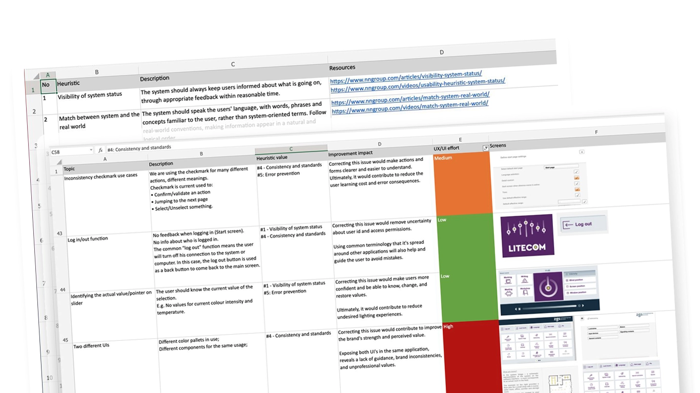
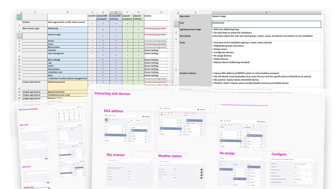
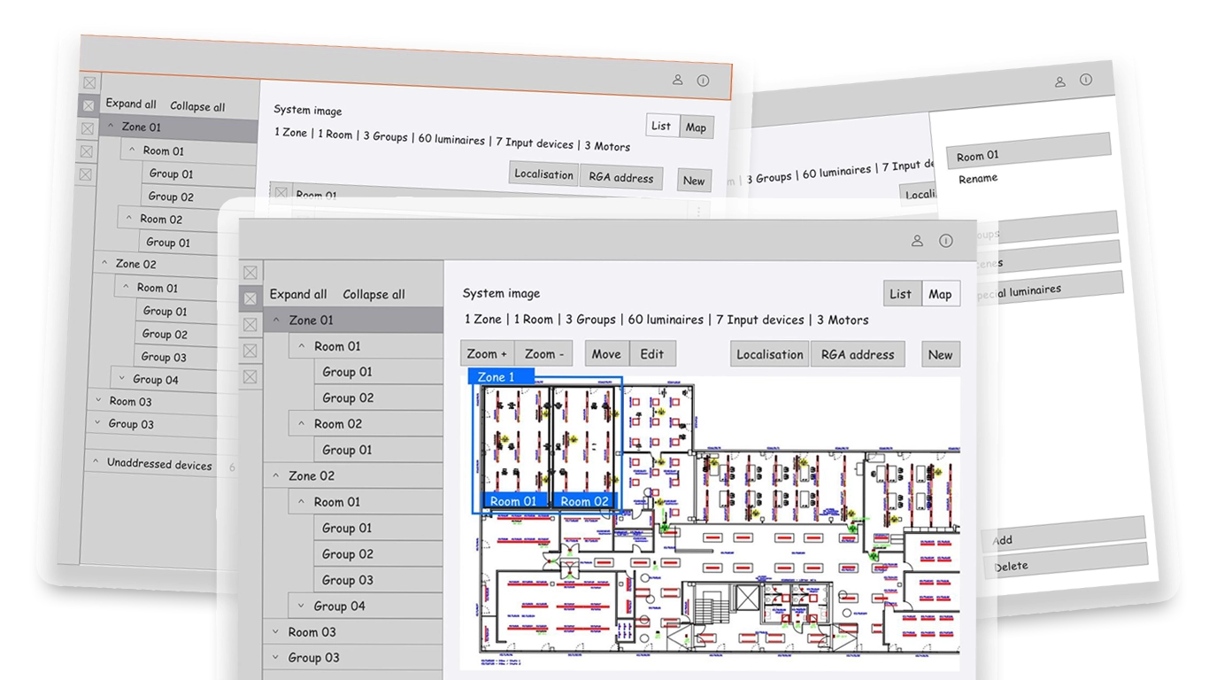
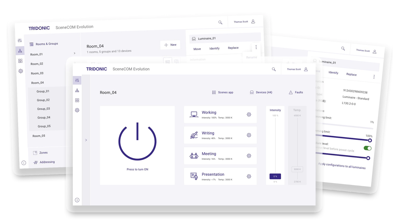
LITEKIT is Tridonic’s flagship software, managing lighting installations across commercial buildings. Launched in 2014, it expanded reactively to customer requests, becoming a cluttered, inconsistent, and fragile product with limited scalability.

When I joined in 2019 as the sole UX designer, I initiated a full UX audit and redesign effort to address structural usability issues and realign the product with user and business goals.

The Problem

A mission-critical tool with no UX direction LITEKIT was developed without a cohesive UX vision.

Each feature was a response to a specific client, resulting in:
• Confusing navigation and task flows
• Inconsistent UI patterns
• Unclear feedback and error states
• Technical limitations that hindered scalability

The result: a mission-critical tool that was hard to use, harder to maintain, and risky to scale.

My Role

• Initiated and led the redesign strategy
• Led a small UX team (2 designers)
• Conducted user research, heuristic analysis, IA, wireframes, and testing
• Acted as the bridge between users, tech, and business

Process & Key Contributions

Heuristic Evaluation

Using Nielsen Norman’s principles, I identified core usability failures. Key insights:
• Inadequate feedback during critical actions
• Multiple inconsistent interaction patterns
• High error cost in live environments (e.g. turning off lights in office zones)

These insights aligned dev teams around a shared understanding of UX debt.

6308131c889a2222967b4e5e20b3b8893129dc8e

Product Mapping

We built a comprehensive view of the system:
• Flow maps and feature breakdowns
• Cross-role dependencies and pain points
• Technical limitations and constraints

This enabled clearer roadmap planning and better stakeholder discussions.

User Research

I interviewed 6 users across 3 key roles:
• End-users: office staff using basic functions
• Commissioners: experienced technicians installing devices
• Facility Managers: responsible for energy optimisation and maintenance


Pain points identified:
• “Planning takes too long
• “Installation testing is inefficient
• “UX is the biggest blocker in adoption

Competitive Benchmarking

I audited competitors’ platforms to identify UX patterns, positioning opportunities, and low-hanging usability wins. This gave our direction credibility with stakeholders.

Information Architecture Redesign

We restructured the app’s navigation:
• Grouped features logically by workflow
• Reduced visual clutter
• Prioritised high-frequency actions

Wireframes & Testing
We designed and validated:
• Map-based interface for spatial device management
• Bulk commissioning workflows
• Drag-and-drop for custom layouts

Testing with real users (technicians in-office) ensured alignment with actual field needs.

Final Stakeholder Review

We packaged the findings into a full proposal and presented them to product owners and tech leads:
• Research-backed prioritisation
• Tested solutions
• Strategic UX debt mapping

Result: Strong endorsement of the UX approach. But implementation was blocked due to architecture limits (15-controller cap).

Outcomes & Impact

Even without a rollout, the redesign achieved:
• A shared language for UX between teams
• Tools and artefacts reused in other products
• Sparked roadmap shifts toward incremental UX improvements

This wasn’t just a redesign; it was a cultural reset for how product, design, and engineering collaborate.

Final Reflection

Not all UX work leads to a launch. But with the right framing, research, and storytelling, it creates internal alignment and product maturity that pays off long after the project ends.

Good design is not just what ships – it’s what transforms how teams think.

Let's get in touch...

If you're passionate about your product and ready to make bold improvements, I'd love to help.
Great design starts with great collaboration.
Ready to work together?

geral[at]bfsilva.com
Back

This website stores cookies on your computer. Cookie Policy